Brand Identity Refresh for Merlin
Merlin is a global digital music licensing partner that represents independent record labels, distributors, and other rights holders. Merlin advocates for indie artists and labels who seek to preserve their artistic integrity by forgoing the path of signing to a big label. Members collectively represent over 15% of the global recorded music market, encompassing a spectrum of genres and cultures.
I designed a new brand ecosystem for Merlin using visual language that speaks to Merlin’s mission to put its members first. The members (and their music) are what makes Merlin what it is, and so it was important to create an identity that mirrored the rhythm and artistry of the music industry, while also maintaining a bold and clean corporate identity that continued to position Merlin as a leader in the music licensing space.

The M-wave pattern uses a stylized version of the Merlin “M” monogram to create an infinitely scalable, repeatable pattern. Reminiscent of sound waveforms, the M-wave pattern speaks to Merlin’s legacy as a leading digital music licensing partner.
Social media posts with M-wave background:


Member names are layered in front of adjacent page elements, to emphasize that Merlin puts its members at the forefront.
The Equalizer Bar pattern is a secondary visual language element that is both a nod to the music streaming experience, as well as Merlin’s role as an equalizer—leveling the playing field for indie artists who do not have access to the resources of a large label when negotiating licensing and streaming deals.
Equalizer Bar Pattern

Social media posts using Equalizer Bar pattern

M-wave and Equalizer Bar Pattern Animations for "New Release Friday” IG stories
The primary brand colors, Soft Black and Off White, are inspired by vintage concert posters, and are backed by an ensemble of vibrant secondary colors and color combinations that honor the diversity of music and creative expression in the Merlin community. Gritty, paper-like textures are used on select assets, to deepen the ties to printed media in the live music scene.


Examples of colors and textures in concert, on member-feature posters.


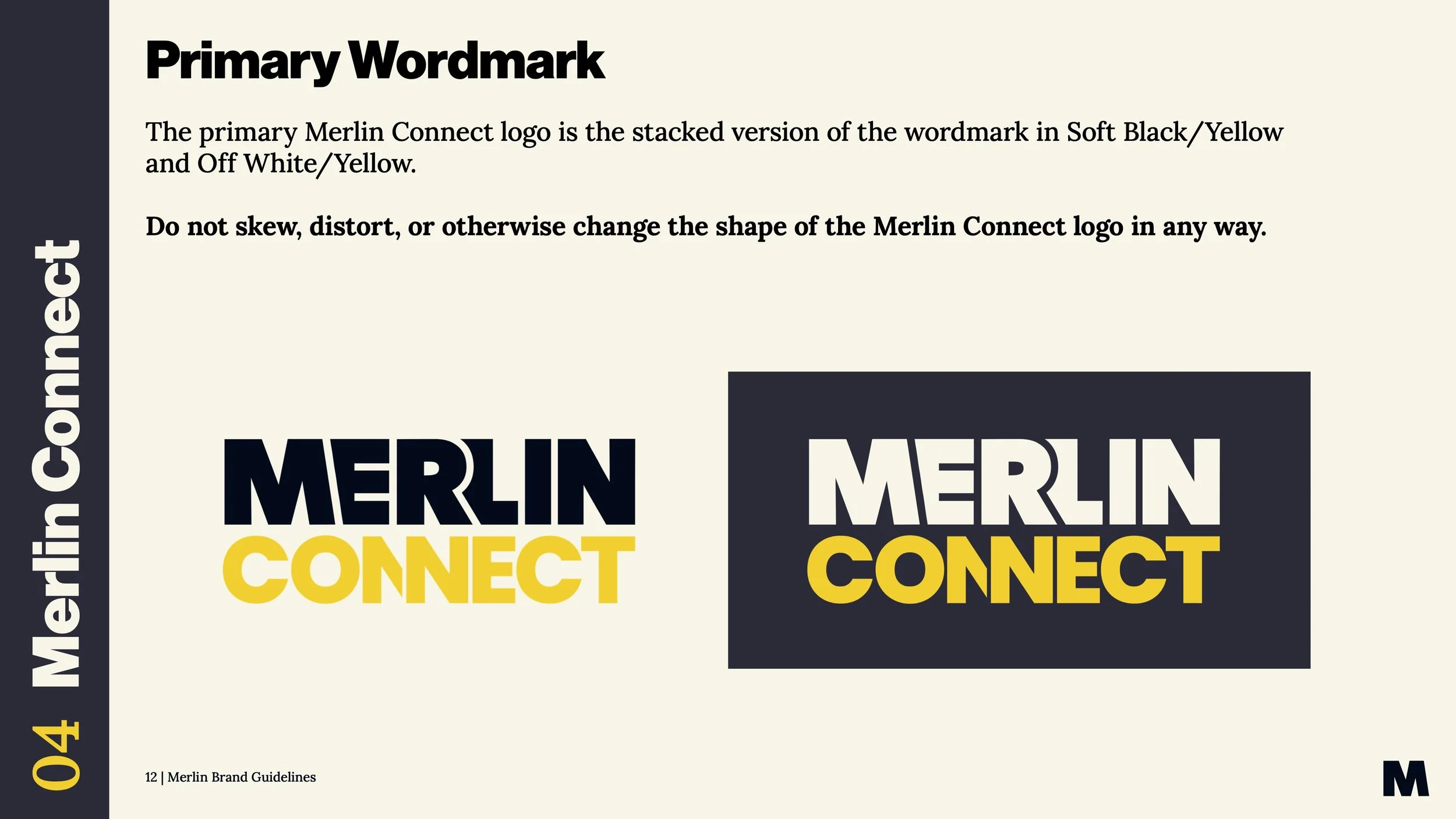
The Merlin Connect sub-brand aims to create new monetization and exposure opportunities for independent music by making it easier for new tech companies to access and use their music.

The new Merlin Connect logo features interconnecting “N”s that echo the M-wave pattern system from the main brand ecosystem.


Ads

Podcast